

TL;DR:
- Mobile SEO is a distinct discipline focused on optimizing websites for quick, local, and on-the-move user behavior, shaped by mobile search habits. Google’s mobile-first indexing makes a fully optimized mobile site essential, with responsive design and fast loading speeds being crucial ranking factors. Continuous technical and content improvements, considering mobile user behavior, are necessary to maintain high mobile search rankings effectively.
Mobile SEO is not just desktop SEO squeezed onto a smaller screen. That misconception has cost countless websites their rankings. Mobile search engine optimization is its own discipline, shaped by how people actually use phones: quickly, locally, and on the move. Since Google fully implemented mobile-first indexing in 2021, your mobile site is your site, at least as far as Google is concerned. What shows up on a phone determines whether you rank. If your mobile experience is broken, slow, or hard to read, your rankings will reflect that across every device.
Table of Contents
- Key takeaways
- What mobile SEO actually means
- Technical mobile SEO factors that matter most
- Mobile content strategy and UX best practices
- How to audit and improve mobile SEO performance
- My honest take on mobile SEO in 2026
- Ready to strengthen your mobile search presence?
- FAQ
Key takeaways
| Point | Details |
|---|---|
| Mobile-first indexing is permanent | Google ranks sites based on mobile content, so your mobile version must be fully optimized. |
| Responsive design beats m-dot domains | Separate mobile URLs create indexing gaps and dilute link equity; one URL with responsive design wins. |
| Speed is a hard ranking factor | Pages taking over 3 seconds to load lose up to 90% of mobile visitors before the page even appears. |
| Content must be mobile-scannable | Short paragraphs, clear headers, and visible text keep mobile users engaged and reduce bounce rates. |
| Local and voice search are mobile-dominant | Nearly half of all Google searches are local, and most voice searches happen on mobile devices. |
What mobile SEO actually means
Mobile SEO is the practice of optimizing your website so it performs well in mobile search results and delivers a smooth experience for users on smartphones and tablets. It covers everything from how fast your pages load on a cellular connection to how readable your text is on a 6-inch screen.
The distinction from desktop SEO goes deeper than screen size. Mobile users behave differently. They tap instead of click, they scroll with a thumb instead of a cursor, and they are often searching with a specific, immediate need in mind. Mobile sessions are shorter but more frequent, and “near me” queries appear four times more often on mobile than on desktop. That means the content and structure that works for a desktop user sitting at a desk may completely fail someone searching from a parking lot.
Google’s mobile-first indexing compounds this. When Googlebot crawls your site, it sends a mobile user agent and indexes the mobile version of your content. If your mobile pages hide content, render slowly, or break layout, that is what Google evaluates when deciding your rankings. Your desktop site, no matter how polished, is secondary.
There are three core behavioral differences you need to account for when planning mobile SEO:
- Touch navigation: Mobile users tap links and buttons with their fingers. Small, closely spaced tap targets cause accidental clicks and frustration.
- Limited screen real estate: Content must be prioritized ruthlessly. Users will not scroll endlessly to find the answer they want.
- Context and intent: Mobile searchers are often mid-task. They want fast, direct answers, not long preambles.
Pro Tip: Run your site through Google Search Console’s Mobile Usability report before you do anything else. It will surface the most damaging mobile issues in minutes, and you can fix the highest-priority problems first.
Understanding these behavioral shifts is the foundation of on-page SEO best practices that actually hold up in mobile search.
Technical mobile SEO factors that matter most
Getting the technical side of mobile SEO right is where most sites either win or quietly fall behind. The good news is that the core requirements are well-defined, and fixing them has a measurable impact.

Responsive design vs. separate mobile sites
The choice between responsive design and a separate m-dot domain is not really a choice anymore. Separate m-dot domains cause indexing discrepancies and split your link equity between two URLs. Responsive design serves the same HTML to all devices and adjusts the layout via CSS. One URL, one crawl budget, one link profile. It is the clear standard in 2026.
| Approach | Indexing risk | Link equity | Maintenance |
|---|---|---|---|
| Responsive design | Low | Unified | Single codebase |
| Separate m-dot domain | High | Split | Dual codebase |
| Dynamic serving | Medium | Unified | Complex setup |
Core Web Vitals on mobile
Google measures three Core Web Vitals: Largest Contentful Paint (LCP), Cumulative Layout Shift (CLS), and Interaction to Next Paint (INP). All three are harder to pass on mobile than on desktop because of slower CPUs, variable network speeds, and smaller screens.
LCP is particularly affected by image loading. One of the most damaging mistakes you can make is lazy-loading above-the-fold images, which delays the largest visible element and tanks your LCP score. Lazy-loading belongs below the fold only.
CLS happens when elements shift after initial load, often because image dimensions are not set in the HTML. INP measures how fast your page responds to a tap or click. Heavy JavaScript is the usual culprit when INP scores are poor on mobile.
Image formats and typography
Switching from JPEG to WebP or AVIF formats reduces file size by 25 to 50 percent at the same visual quality. That is a direct improvement in load speed without any sacrifice in appearance. On slow mobile connections, this difference is noticeable to users and measurable in your rankings.
Typography matters more on mobile than most webmasters realize. Google recommends a minimum font size of 16px on mobile. Smaller text triggers automatic zooming on iOS, which breaks your layout and creates an accessibility barrier that drives users away immediately.
Pro Tip: Use Chrome DevTools in device simulation mode to check both your LCP element and your font rendering at common phone screen sizes. You can spot zoom issues and image loading problems before they affect real users.
Hidden content and Googlebot
One underappreciated risk in mobile SEO is content hidden behind accordion menus or tabbed interfaces. Content not rendered for Googlebot during a mobile crawl is effectively invisible for ranking purposes, even if users can expand it. If your most important product descriptions or FAQs live behind a collapsed tab, Google may never index them. Critical content needs to be visible in the initial HTML response.
Mobile content strategy and UX best practices
Technical optimization gets you in the game. Content strategy and user experience are what keep people on your site and convert them into customers.
More than 60% of website traffic now comes from mobile devices. That number alone should shift how you think about content structure. If you write long paragraphs for desktop readers and then hope they translate to mobile, you are working against your audience.
Here is what a mobile-first content approach looks like in practice:
- Lead with the answer. Mobile users have low patience for buildup. Get to the point in the first sentence, not the third paragraph.
- Use short paragraphs. Three to four sentences per paragraph is a firm ceiling for mobile. Big text blocks cause users to bail.
- Write scannable headers. Your H2 and H3 headings should tell the whole story when read on their own. Mobile users skim first and read second.
- Minimize pop-ups and interstitials. Google penalizes intrusive interstitials on mobile directly. A full-screen pop-up that fires before the content loads is both a ranking risk and a user experience failure.
- Size tap targets appropriately. Buttons and links should be at least 48×48 pixels. Anything smaller invites accidental taps and frustrated exits.
Local and voice search deserve specific attention. 46% of Google searches are local, and the majority happen on mobile. If your business has a physical location, optimizing your content for “near me” queries and making sure your Google Business Profile is complete and accurate directly affects your mobile visibility. You can find a deeper breakdown of how local signals interact with rankings in Battleseo’s guide on local SEO content marketing.
Voice search adds another layer. Conversational queries like “where can I get a tire rotation near me?” are structurally different from typed queries. Answering them means using natural language in your content, including question-and-answer formats, and targeting long-tail phrases that match how people actually speak.
Investing in mobile landing page optimization is the natural extension of getting your content structure right. Design and content decisions work together on mobile in ways that do not apply on desktop.
How to audit and improve mobile SEO performance
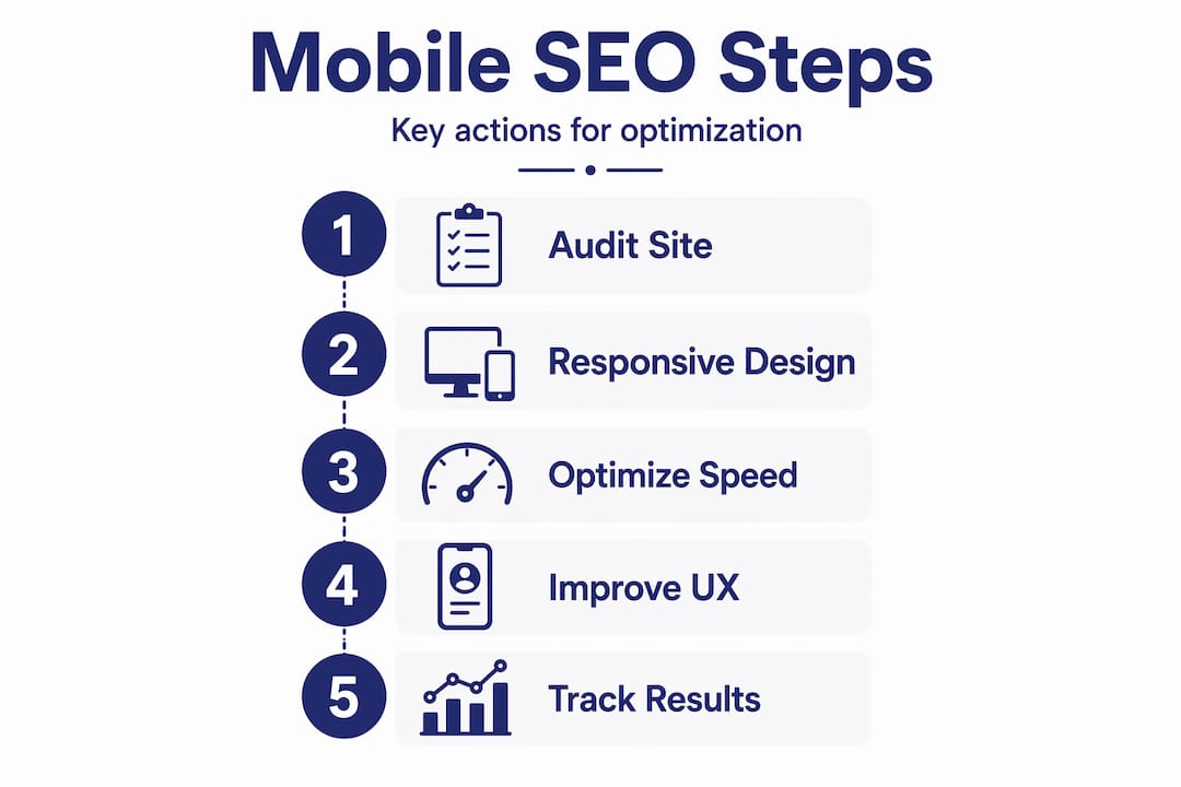
Knowing what mobile SEO is matters less than knowing what to do about it. Here is a practical sequence for auditing and improving your mobile performance.
-
Run Google Search Console’s Mobile Usability report. This surfaces clickability issues, viewport configuration problems, and content wider than the screen. Fix every flagged issue before moving on.
-
Test page speed with PageSpeed Insights. Enter your URL and switch to the mobile tab. Google will score your Core Web Vitals and tell you exactly what is slowing you down, including render-blocking resources and oversized images.
-
Check your responsive design across real devices. Simulators are useful, but real devices reveal issues that emulators miss. Test on at least two screen sizes and two browsers.
-
Audit your images. Identify every JPEG that could become a WebP or AVIF. Set explicit width and height attributes on all images to prevent layout shift. Remove lazy-loading from any image in the top half of the page.
-
Verify your content visibility. Use the URL Inspection tool in Google Search Console to see what Googlebot actually renders on your page. If you use accordions or tabs, confirm your critical content appears in the rendered HTML.
-
Review your local signals. If you serve a local market, check your Google Business Profile, your citation consistency across directories, and whether your site content references the city and service area naturally. Understanding how Google ranks local results will help you prioritize which signals to fix first.
-
Monitor and iterate. Set up a monthly review of your Core Web Vitals in Search Console. Mobile SEO is not a one-time project. Google updates its algorithms, user behavior shifts, and your site changes. Continuous monitoring is what separates sites that hold rankings from those that gradually slip.
You can also use mobile UX testing tools to measure how real users interact with your pages, where they drop off, and what friction points prevent conversions. Data from actual users is more reliable than any single audit tool.
My honest take on mobile SEO in 2026
I have worked on enough mobile SEO projects to tell you that the biggest problems are almost never what site owners expect. They come in assuming they need to add keywords or build more links. The real issues are almost always technical and structural: fonts that are too small, images that kill LCP, or important content buried in a tab that Google never renders.
The other thing I have seen consistently: teams treat mobile SEO as a one-time checklist. They fix the flagged errors, publish the fixes, and move on. Six months later, a new plugin, a design update, or a content change has reintroduced the same problems. Mobile SEO requires a standing audit process, not a one-time sprint.
What actually works is pairing technical discipline with content that respects how mobile users think. Fast pages with bad content still bounce. Well-written content on a slow site still fails. The sites that consistently perform in mobile search do both things well, and they check their work regularly. That is not a glamorous insight, but it is the one that matters most.
— Mike
Ready to strengthen your mobile search presence?
If you have read this far, you understand that mobile SEO is a technical and strategic discipline that requires consistent attention. Most independent business owners and webmasters do not have the time to manage it properly while running their core operations.

Battleseo works exclusively with one business per category per market, which means when we take on your mobile and local SEO services, your competitors in the same space do not get the same help. Our Local Command Directive™ framework covers everything from page speed and mobile UX to Google Business Profile optimization and authority link building. If you want to dominate mobile search in your market, explore what Battleseo’s AI search optimization guide covers and reach out to see if your market is still open.
FAQ
What is mobile SEO in simple terms?
Mobile SEO is the process of optimizing your website so it ranks well in mobile search results and works smoothly for users on smartphones and tablets. It covers speed, layout, content structure, and local search signals.
How does mobile-first indexing affect my site?
Google crawls and ranks your site based on its mobile version. If your mobile content is incomplete, slow, or poorly structured, your rankings will suffer across all devices, not just mobile.
What is the most important mobile SEO ranking factor?
Page speed is the most direct mobile ranking factor. Sites loading over 3 seconds risk losing the majority of mobile visitors before the page finishes loading, which signals poor quality to Google.
Should I use a separate mobile site or responsive design?
Responsive design on a single URL is the correct approach. Separate m-dot domains split your link equity and create indexing inconsistencies that harm your rankings.
How do local searches connect to mobile SEO?
Nearly half of all Google searches have local intent, and the overwhelming majority of those happen on mobile devices. Optimizing your Google Business Profile and including location-relevant content directly improves your mobile visibility for nearby searchers.